Upscaling UX Research at Scotiabank
As a UX Researcher at Scotiabank, I developed research tools to enhance UX Research across the organization; including a user recruitment platform, innovative methods for conveying user behavior, a toolkit to empower designers, and a centralized research repository for improved knowledge management.
Company: Scotiabank
Domain: Banking
My role: UX Researcher
Skills: Research ops, generative research, stakeholder management, product strategy
Timeline:  2021 - 2022
Abstract
Collaboration is one of the key principles that underpins my work. I thoroughly enjoy working alongside people from different teams and countries to create exceptional outcomes. While at Scotiabank, I not only conducted research studies but also played an instrumental role in enhancing and democratizing research across the entire Digital Banking Team. Specifically, I led the design and implementation of several tools that contributed to this effort.
UX Research Tools
Designing Scotiabank’s first recruitment platform for research activities.
Socializing an intersectional behavioral approach to digital banking clients.
Empowering designers and leveraging UXR methods and best practices
Streamlining UX Research for seamless collaboration and discovery
Creando Contigo
When conducting research, getting the right participants is critical. Long recruitment times and high cancellation rates were threatening the cadence and quality of research activities at Scotiabank. Seeking to tackle this challenge, I created Creando Contigo, an organic user community that serves as a recruitment platform for research activities. Up to date, Creando Contigo has supported the recruitment of over 85 research projects at Peru’s Scotiabank Digital Factory and inspired the creation of recruitment communities across Scotiabank offices in Latin America.
My contributions
As the project lead of this initiative, I was responsible for the end to end process of Creando Contigo:
Ideated the concept and conducted a competitive analysis of other user recruitment platforms.
Designed the recruitment platform’s information architecture.
Collaborated with a UX Designer and UX Writer to design the user interface and content.
Managed stakeholders in design, legal, privacy, engineering, and marketing teams.
Developed a campaign and launched the site!
Due to organizational restructuring, the research team experienced a significant decrease in budget, which prevented the hiring of recruitment companies. Obtaining participants for research became difficult, resulting in fewer research activities being conducted. We increasingly relied on "friends and family" candidates, which ultimately biased our research as everyone was using the same pool of participants. Additionally, the recruitment process took over three weeks, and the procedure for soliciting users was not centralized or communicated to all UX Designers on the team. Our recruitment efforts were slow and inefficient.
Context
There was a need to design a recruitment strategy to optimize our recruitment efforts, reduce recruitment time and cancellations, improve our candidate diversity, and continue to conduct quality research.
Objective
I conducted research on user communities, analyzing companies like Google Play, Microsoft Teams, and Evernote, and found that they focused on intrinsic motivation for product improvement. After receiving approval, I created an information architecture and wireframes for a new feature, consulting with various teams such as Legal, Privacy & Compliance, Engineering, and Marketing. I collaborated with a UX Designer to create a high-fidelity website version, ensuring user data privacy. Additionally, I developed an internal process and training for utilizing our recruitment tool and negotiated incentives for users through gift card offerings.
Action
After successfully navigating stakeholders and dealing with constraints, we were able to launch Creando Contigo in May of 2022. Creando Contigo is still used as a primary source for participant recruitment at Scotiabank. Up to date, Over 1K users signed up organically, impacting 87 research projects across Digital Banking since its launch in 2022.
What we’ve seen so far:
Impact
-
The biggest pain point was waiting approximately 3 weeks to set up a proposal, contact the recruitment agency, and wait for the information. Now, researchers and designers have gained more autonomy in the process, and they can recruit participants for same-week activities. Moreover, cancellation rates from friends and family participants fell significantly, given the intrinsic motivation of participants joining the community.
-
Strategically decentralized our participants and research activities from Lima (capital city in Peru) to six new cities in Peru: Cusco, Arequipa, Chiclayo, Trujillo, Piura and Ica.
-
Creando Contigo served the initiation and encouragement of research activities across different Product, Marketing, Business Intelligence teams, fulfilling the mission of upscaling research beyond the design team. Since its foundation in May 2022, Creando Contigo has sourced the recruitment of participants for 87 different research projects.
-
As part of the Creando Contigo community, we developed a monthly newsletter, where we were able to get closer to our client and be accountable with them. Through the research newsletter, we share how the voices and key findings from the participation of users in our research are shaping our design decisions at Scotiabank.
-
Creando Contigo inspired the foundation of Colombia and Mexico’s own research communities given the similar challenges their teams were experiencing.
This is a project I feel very proud of because I was able to focus on internal users and support my team internally. I had a vision and was able to make it a reality, supporting the research practices of Scotiabank and facilitating the processes of my busy UX Designer peers.
Although hard from time to time given the several constraints each team communicated, I was able to manage several stakeholders, meet new people, and learn so much about the different things they do, as well as getting a better understanding of the process when wanting to launch something new.
Learnings & reflections
ScotiaPersonas
Scotiabank Peru, a banking platform with over 2.5M users, faces challenges in catering to the diverse needs of its heterogeneous user base. Previously, user segmentation was solely income-based. However, through research, we uncovered behaviors, motivations, and experiences that determined users' financial maturity irrespective of account balances. This led to the creation of ScotiaPersonas, a potent design tool that enables Scotiabank Peru to better serve its customers.
Team: UX Researcher & Service Designer
As a UX Researcher and project lead I:
Designed and led early problem-scoping workshops with stakeholders in Product, Design, Marketing, and Engineering teams.
Crafted a generative research plan.
Designed surveys to triangulate data from different primary sources.
Conducted user interviews.
Created customer journey maps.
Analyzed and synthesized data.
My contributions
As Scotiabank Peru continues to evolve into the world of digital banking, we struggled to understand who our new customers are and how to offer a strong value proposition according to their financial and personal needs.
Context
Develop a more human-centric way to understand our users' needs and behaviors, beyond their income level.
Objective
Hypothesis-generation workshop: Engaged stakeholders from various teams to gather insights and generate hypotheses about Scotiabank clients using a Miro board and co-creation session.
Generative research: Collected data through surveys and interviews with Scotiabank branch representatives and clients. Surveys aimed to understand client behavior and pain points from branch representatives' perspectives. Semi-structured interviews were conducted with selected branch representatives and clients to obtain qualitative insights and triangulate the data collected in the surveys.
Synthesis & Analysis: Categorized interview findings by highlighting information about clients' behaviors, motivations, and needs.
Key drivers: Identified key drivers present in clients' lives, such as security, experience, vitality, aspiration, and knowledge, among others. Paired key drivers with users to observe patterns and shared characteristics.
Insight generation: Crafted insights following the principles of atomic research, after organizing the findings from diverse sources of information, such as the surveys, interviews, and past research.
Financial maturity: Through analysis, we determined that clients' behaviors and needs towards Scotiabank are influenced by their financial maturity. Financial maturity refers to a person's development in relation to the financial world and can evolve based on experiences, societal influences, personal relationships, and interactions with financial institutions.
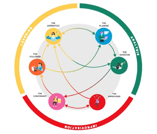
Identifying mindsets: Our research findings revealed three core mindsets reflecting different levels of financial maturity:
Improvisation: Users with basic banking knowledge, primarily using traditional financial products. They focus on short-term plans without a fixed savings strategy and have tendencies toward emotional spending.
Learning: Users with basic financial maturity actively seeking knowledge to improve their financial management. They aim to better understand and utilize available products and services.
Analysis: Users with high banking and financial knowledge, adept at managing personal finances using traditional and complex products. They understand the importance of saving and are aware of the best financial products and rates.
Action
ScotiaPersonas: A new way to understand Scotiabank’s clients intersectionality and financial behavior.
For each ScotiaPersona, a detailed analysis was created, providing relevant information for Scotiabank's Digital Factory teams. The data points include:
Main challenges: Financial obstacles faced by the user profile.
Key needs: Primary financial requirements for the user profile.
Objectives: Goals that the user profile aims to achieve.
Possible products and benefits: Relevant products and benefits for the user profile.
Savings profile: The user's approach to saving.
Key drivers: Factors influencing the user profile's life in and outside the banking environment.
Life moments: Significant events that may trigger changes in the user persona.
Financial advice: Recommendations that Scotiabank should offer to the user profile.
Learning style: How the user profile acquires new information.
Communication strategy: The most effective method to engage with this user profile.
Impact
Instrumentalizing ScotiaPersonas within and beyond Design teams
After developing the ScotiaPersonas, we wanted to instrumentalize their use beyond the Design team. Hence, we partnered with the Data Analytics team by classifying each persona’s core measurable behaviors. Databases that grouped clients that represent the core behaviors of each ScotiaPersona were curated.
In that way, we can not only continue to test, iterate and enrich the characteristics which ScotiaPersonas are built upon but most importantly, provide a design tool that can be used interdisciplinary.
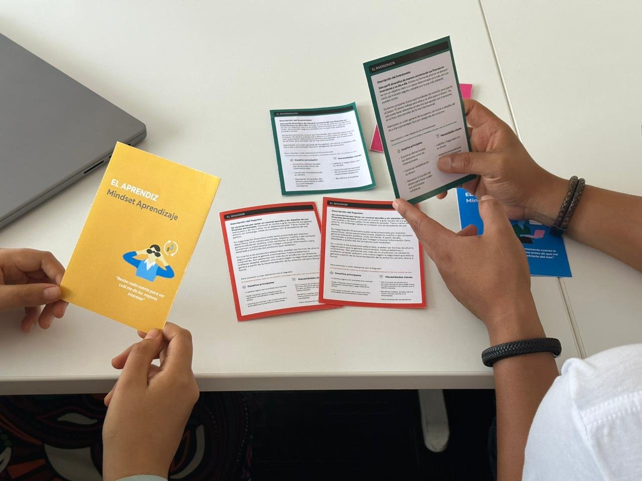
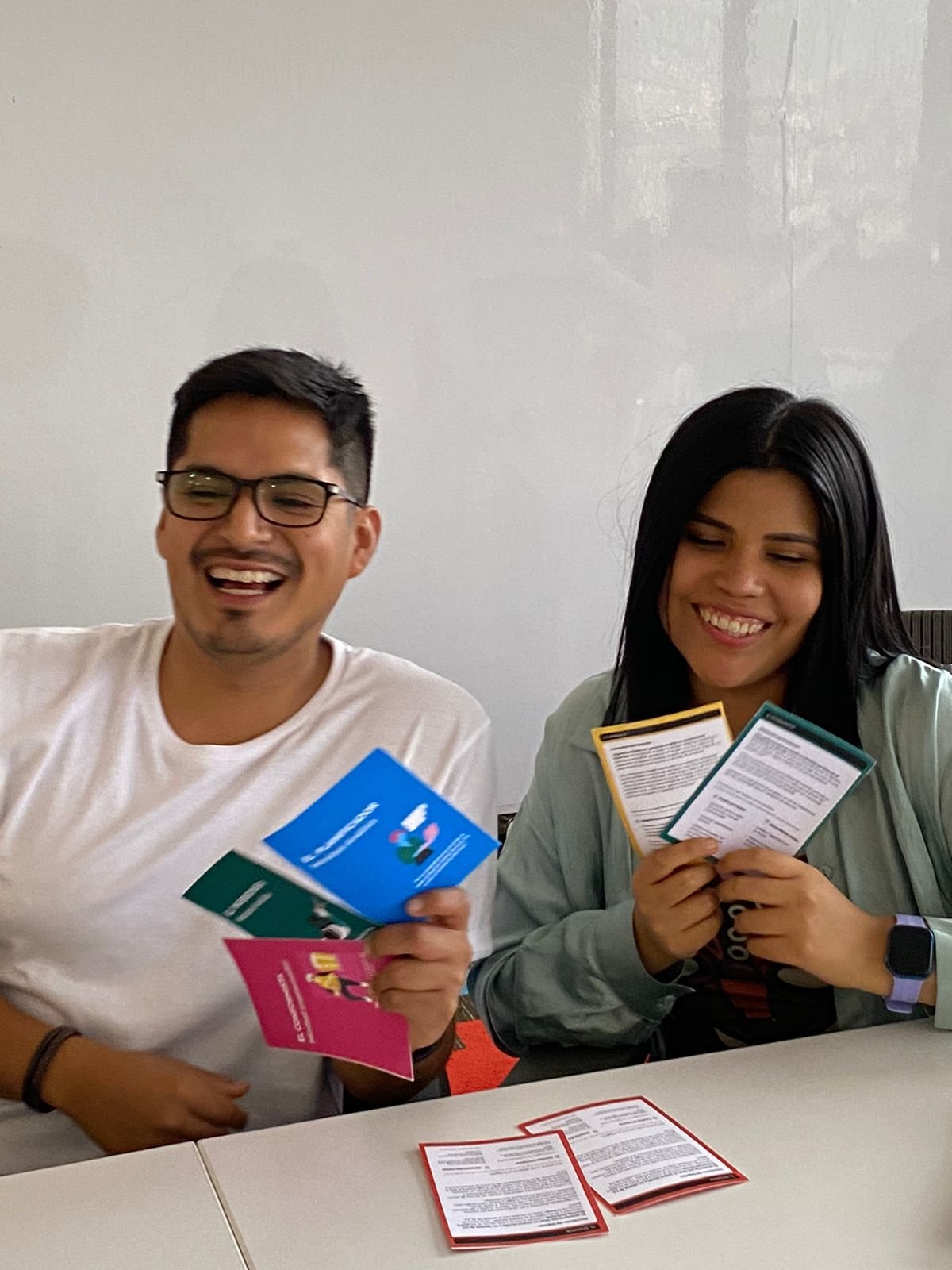
Seeking ways to enhance the use of our ScotiaPersonas, we developed a deck of cards targeted to be used at the ideation stage of any project. This design artifact is currently being tested with Design, Marketing, and Product teams, seeking to push a more human-centric product and service strategy.
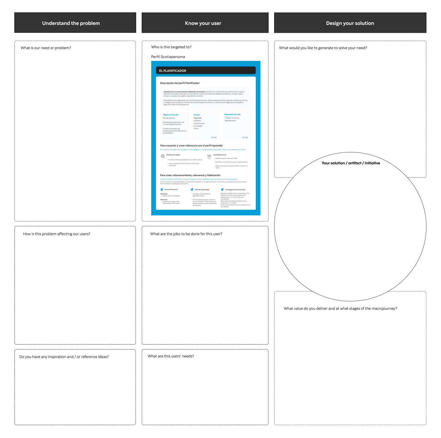
Alongside the deck of cards, we prototyped an ideation blueprint. This blueprint is currently being tested. Through it, we hope to encourage a human-centered process by the use of ScotiaPersonas across multidisciplinary teams.
Diversifying research methods:
In order to improve the quality of our study, we sought to expand our research techniques beyond just surveys and interviews. By integrating observations and contextual inquiries, we aimed to collect more pertinent data.
Ensuring findings' representativeness:
It is crucial to assess the representativeness of our discoveries, as making inferences based on a limited user sample could lead to skewed outcomes. To guarantee precision, we used quantitative triangulation through user surveys and executed behavioral experiments in collaboration with the Data Analytics team as a component of our ScotiaPersonas initiative.
Encouraging the adoption of new concepts can be hard:
While our ScotiaPersonas project attracted attention from various teams, there remained some ambiguity regarding the Personas' application. To tackle this challenge, we developed a more actionable and user-friendly blueprint, even if it might not have been the most efficient solution.
Learnings & reflections
UX Research Toolkit
A collaborative UX Research-led team initiative in empowering and training designers and other professionals in conducting high-quality research for digital banking. With a small team of researchers, the community of practice aimed to transition the research team from bearing complete responsibility to serving as supportive mentors and guides. The efforts concluded in an UXR Toolkit socialized to Scotiabank Design teams across Latin America.
Team: UXR Community of Practice (8 UX Researchers across Chile, Colombia, Mexico and Peru)
I led the project by:
Scheduling and moderating our meetings.
Working on developing the context for UX research methods.
Advocating for the socialization of the UXR toolkit.
Presenting the project to our Pacific Alliance community.
My contributions
As a member of Scotiabank's Design team, I was part of an international design community and a smaller cohort of researchers who met bi-weekly to share research, feedback, and resources. Despite capacity challenges due to the ratio of one researcher per seven designers, we aimed to empower and train designers and other practitioners to conduct research, reducing their reliance on researchers.
Context
Our task involved pinpointing optimal methods for training designers and other professionals in digital banking to carry out high-quality research throughout their procedures. We aimed to transition their view of the research team from bearing complete responsibility to serving as supportive mentors and guides.
Objective
Through our own respective countries, we designed a survey seeking to evaluate our UX Designers’ research knowledge and learning appetite. We wanted to identify the types of methods they were interested in learning and also those relevant for the work they were conducting.
After analyzing the information, the Research Community of Practice got together and started mapping out the types of methods and theories that were relevant. Divide-and-conquering on individual areas of expertise and interest, we divided methods among every researcher across generative and evaluative research. We agreed upon the format we would follow:
Format
What is the method?
What is the outcome?
Suggested participant number
Preparation time
Execution time
Tools when employing the method in-person
Tools when employing the method remotely
When diving deeply into each method, the user would learn:
When to use this method
When not to use this method
How to employ it
What is needed
Recommendations + Pro tips
Tools
Action
Democratizing research in Design teams across Latin America
Once the toolkit was done, we presented the project at the Monthly Design Community of Practice meeting. We shared the UXR Toolkit locally and across our Pacific, American, and Caribbean partners. In addition to the toolkit, we started scheduling research workshops for existing practitioners and new hires.
Create a more collaborative environment and foster a culture of continuous learning
Enhanced the research capabilities within the organization but also increased the overall efficiency and effectiveness of our design teams
Getting acquainted with the UXR toolkit became part of the onboarding process for new hires, as a useful resource when joining the Design team across Latin America.
Impact
I had the opportunity to take leadership in an international initiative. This experience provided valuable insights into collaboration, communication, and project management across diverse teams and cultures. Working closely with other researchers, I gained a deeper understanding of various research methodologies and practices, enabling us to develop a comprehensive toolkit.
The process of empowering designers to conduct quality research has been highly rewarding. We identified a shift in the way designers approached research, where more autonomy and competence was evidenced in their work. This not only improved the research capacity within the organization, but it also boosted the overall productivity and performance of our design teams. Overall, this initiative has significantly contributed to the growth and development of research practices at Scotiabank across Latin America.
Learnings & reflections
UX Research Repository
In our organization, UX research insights were often scattered across various platforms, such as PowerPoint presentations, Google Drive, and Slack messages. This decentralized storage led to valuable insights being overlooked, and in some cases, no action was taken based on the findings. Consequently, teams were duplicating research efforts on existing information, and vital data was getting lost in the process.
By designing the UXR Repository, I was able to:
Streamline access to research insights.
Prevent the duplication of efforts enhancing the efficiency and effectiveness of the design teams.
Promote informed decision-making.
Foster a culture of collaboration and knowledge sharing within the Design team and cross-functionally.
My contributions
In our organization, UX research projects and insights were often scattered across various platforms, such as Figma presentations, email attachtments, and Slack messages. This decentralized storage led to valuable insights being overlooked, and in some cases, no action was taken based on the findings. Consequently, teams were duplicating research efforts on existing information, and vital data was getting lost in the process.
Context
To address these issues, my goal was to create a centralized UX research repository that would store research data and notes in an easily retrievable, accessible, and usable format for the entire team.
Objective
Audit: I began by conducting a comprehensive audit of all existing research data and documentation spread across different platforms and formats. This included research studies ages before I joined Scotiabank.
Categorization: I categorized the research studies and findings based on themes, projects, and dates to create a coherent structure for the repository.
Standardization: I established a standardized format for documenting research insights, ensuring consistency and ease of understanding.
Platform selection: After evaluating various knowledge management platforms, I opted to use Microsoft’s OneDrive, given that every member of the Digital Banking team, including Product and Marketing teams, had access to it. Although Figma was a strong candidate, I realized many people outside the Design team weren’t too acquainted with the platform.
Training and adoption: I conducted training sessions to familiarize the Design team with the repository and its features, and integrated it into our regular workflows. This also included a standardized form to document information.
Maintenance: We set up a process for regular updates and maintenance of the repository to ensure it remains current and relevant.
Socialization: We communicated the existence of our UXR repository to all members of the Digital Banking team and encouraged them to visit it to inform their every-day decisions and optimize efforts when planning new research or design projects.
Action
A centralized information hub
The UX research repository has proven to be a valuable asset for our organization. It has streamlined access to research insights, preventing duplication of research efforts, and promoting more informed decision-making. The centralized knowledge management system has also fostered a culture of collaboration and knowledge sharing among team members. As a result, our design teams have become more efficient and effective in their work, ultimately leading to better user experiences and outcomes.
Impact
Creating a UX research repository was a valuable learning experience for me. By developing a centralized platform, I was able to solve a recurring pain point that had long existed within the design team, which in turn facilitated easy access to knowledge and optimized research efforts. As a result, designers were able to make more evidence-based decisions, resulting in more informed and effective design solutions. This experience reinforced the importance of centralizing data and promoting knowledge sharing, which are key to driving organizational growth and success.


